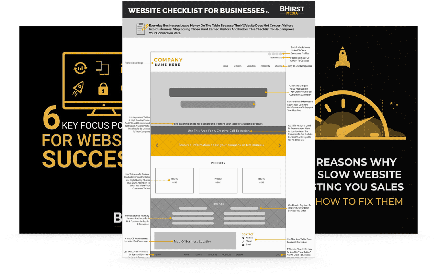
There are few things more frustrating than losing visitors mere seconds after they’ve clicked onto your website. Although you can’t be a mind reader, you should still know what it takes to keep visitors interested long enough to engage with your site and eventually become paying customers.
Keeping visitors on your site longer and reducing your bounce rate should be a top priority for your business, but how do you keep them interested enough to stick around? It’s not as difficult as you think, but it may require updating (or overhauling) your website to make it more visitor-friendly.
Here are five super strategies to keep visitors on your website longer and reduce your bounce rate. How many of these are you using on your site now? How many could you implement immediately for better results? Let’s take a look.
Bounce rate is a measurement of the percentage of visitors to your website who arrive on one page and do not engage with it at all before clicking off. They may click on the site, glance at it, and promptly leave.
Why is this important? Google takes note of how many people are bouncing off your site, and they penalize you for it by ranking you lower in search results. The assumption is that if visitors aren’t finding what they’re looking for on your site, then it’s not a great quality website and shouldn’t be promoted by the search algorithm.
Improving your bounce rate and keeping visitors on your site (and fully engaged on it) for longer will help improve your Google rankings and help visitors find you when they search. If you’re suffering from a high bounce rate, these strategies should help.
Websites are inherently visual in nature. If your website looks messy or confusing, people are going to skip right back off and find another site that is more visually appealing and easy to understand.
Website design is trickier than many people realize. You have to strike a delicate balance between presenting all the important information and overloading your visitors. A cluttered, clumsy-looking site won’t do your business justice and may give visitors a sense that you’re unprofessional or simply not skilled enough to meet their needs.
Cleaning up your design can mean many things. It could be as simple as electing for a more streamlined WordPress theme that doesn’t leave behind bits of broken code, or as intensive as going back to the drawing board for a rebrand and simplification of your message for the web. Either way, it can be hard to decipher exactly what needs to go, so consulting with a professional web designer is highly recommended.

It’s essential to populate your website with useful, relevant content that your visitors can actually find value in. It’s also important not to overwhelm them with large chunks of text, especially if that text contains lots of technical jargon that they might not understand. Your goal with any content is to build trust and offer value to your visitors on a consistent basis.
Even your font plays a vital role in keeping people on your website. Fonts should be professional, easy-to-read, and large enough to skim at a glance. Using bullet lists and headings helps break up your content into bite-sized, easily digestible chunks that visitors will appreciate.
Moreover, making sure that written content on your site is updated regularly means you’re giving your visitors a reason to return and learn more about your niche, your products, and your business, establishing you as an authority in your space and creating consecutive impressions.
If visitors can’t find something on your site, they’re going to leave. Don’t make them jump through hoops to find what they’re looking for. Adding a search box and a clearly labeled navigation menu is good, but you can take it a step further by using direct calls-to-action to guide visitors to where you want them to go.
Add buttons or links encouraging visitors to do things like ‘read more’ or ‘get in touch’ or even ‘download now.’ By telling the customer what you want them to do and offering them an easy way to do it, you’ll keep them engaged for longer.
If you’ve ever gone down a rabbit hole of a website, clicking the next article or blog post, again and again, you’ll know what your website should look like. By linking to other content on your site, you draw the visitors deeper, keeping them there for longer.
Just be careful not to go overboard with the internal links. Too many, and Google can penalize you. Try creating a section of related posts to share other content from your site. It makes it easy for visitors to get pulled in without feeling too spammy.
Visitors come to your site because they want answers, not because they want to be assaulted by pop-ups and tons of ads. Anything that gets in the way of their search for a solution is simply an annoyance. If you have too many annoyances on your site, visitors will leave.
Try to minimize the number of ads on your website and keep the placement discrete. If you have to use a pop-up, don’t have it show up the minute visitors arrive on your site and make it very easy to remove. The less frustrated visitors are, the longer they’ll stay, so keep this in mind when designing your website.
Web design and development are tricky if you aren’t an expert. Let us help you create a website that keeps people coming back and staying for longer. At BHirst Media, we offer a range of website design and development services that include web design and care plans, including SEO services that will help your site become more visible.
Contact us today to see how we can help transform your website into a place where your visitors love to spend their time and keep coming back.
