Designing a Captivating Hero Sections for Your Website
Key Takeaways
The hero sections of your website is often the first impression visitors have, making it a crucial tool for engagement and trust-building. By leveraging effective design strategies and customer-focused elements, you can create a powerful introduction to your brand. Here are the key takeaways:
Hero sections set the tone for your entire site: As the first element visitors see, a hero sections acts as your site’s focal point, influencing user retention and brand perception.
Craft clear, compelling headlines that communicate value: Your headline should immediately highlight your unique value proposition and resonate with your audience’s needs.
Authentic visuals boost visitor trust and engagement: Use high-quality, relatable imagery or videos that reflect your brand identity and establish an emotional connection.
Strong CTAs drive user action and conversions: Strategically place clear and actionable call-to-buttons (CTAs) to guide visitors toward desired actions, such as signing up or exploring further.
Minimalistic design enhances clarity and focus: Avoid overcrowding the hero section; prioritize simplicity with ample white space to make key elements stand out.
Responsive and adaptable designs improve user experience: Ensure your hero section is optimized for all devices, maintaining functionality and visual appeal across screen sizes.
Avoid generic content that dilutes your brand message: Personalize your hero section with specific messaging and visuals aligned with your audience’s preferences, rather than using overused stock elements.
Examples offer inspiration for effective hero design: Analyze successful hero sections, such as those with interactive elements, seamless animation, or bold typography, to spark creative ideas.
Data-driven adjustments enhance ongoing performance: Continuously test elements like headlines, visuals, and CTAs to optimize engagement metrics and conversion rates.
A well-designed website hero section has the power to captivate visitors, communicate your brand’s value, and drive conversion-focused actions. In the following sections, we’ll explore detailed examples and actionable best practices to help you create a hero section that stands out in today’s competitive digital environment.
First Impressions Matter: Designing a Captivating Hero Section
Your website’s hero section is the digital equivalent of a storefront window—the first thing visitors see—and first impressions matter more than ever. In just a few moments, it can entice them to explore further or send them looking elsewhere. But what elevates a hero section from merely adequate to truly engaging and conversion-driven?
A compelling hero section does more than just introduce your site; it acts as your brand’s digital handshake, immediately communicating your core value proposition before a visitor even considers scrolling down. Effective design strategies, when combined with customer-centric elements, can transform this section into a powerful tool for engagement, trust-building, and ultimately, conversions. In fields like healthcare, a well-designed hero section on a hospital’s website can ease patient anxieties by showcasing a welcoming environment and clear access to services. Similarly, in finance, a trustworthy and informative hero section can build confidence in potential investors.
Let’s delve into the best practices for designing a website hero section that captures attention, fosters trust, and drives conversions, with engaging examples to spark your creativity.
Understanding the Core Importance of Hero Sections in Website Design
Every website visitor’s journey often begins with what they see first: the hero section. This prime real estate at the top of your website does more than just greet visitors—it encapsulates the essence of your brand, communicates your USP (Unique Selling Proposition), and sets the tone for what’s to come. A poorly executed hero section can result in visitors leaving your website within seconds. A study by Kissmetrics found that 55% of visitors spend on average 15 seconds on your website. This means you only have a brief window to make an impression.
To emphasize, this isn’t just about aesthetics; it’s about strategic communication. Consider its application across different sectors:
In e-commerce, a visually striking hero section showcasing seasonal sales can drive immediate purchases.
For educational platforms, it highlights course offerings and enrollment benefits.
Non-profits use it to convey their mission and impact through compelling visuals, encouraging donations.
A strategic approach to your hero section design can significantly influence visitor retention and drive conversions. Great design isn’t about being flashy but about being memorable and impactful. A compelling hero section directly impacts lower bounce rates, increases time on page, and ultimately, fosters greater engagement. Consider Zappos, for example, whose homepage hero section dynamically changes to reflect different products, sales, and promotions. This strategy captures attention, leverages the principle of urgency, and has led to a measurable increase in click-through rates.
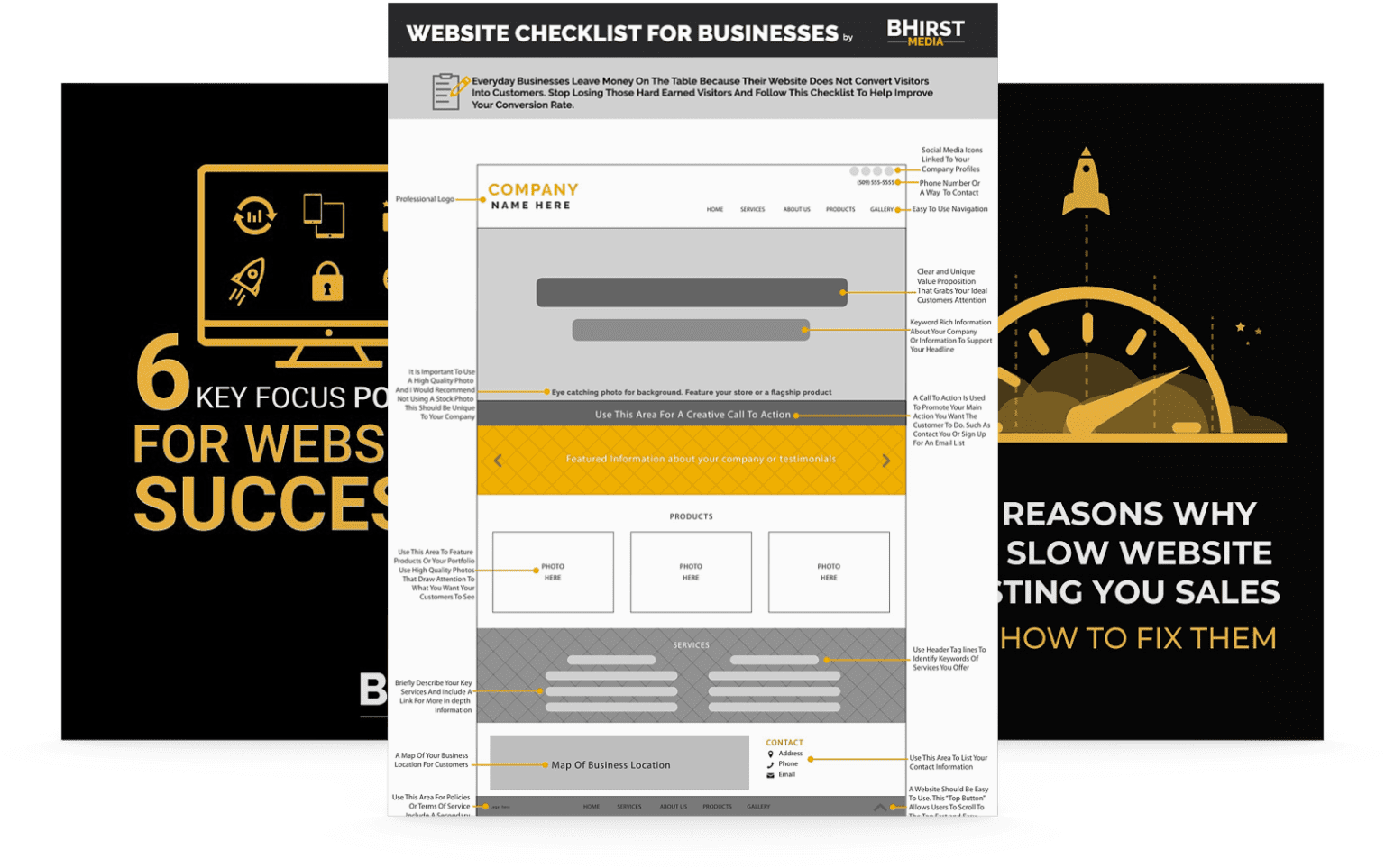
free Guide
Learn how to make your next website project a winner.
Download our free guide to learn the secrets to a successful website project, featuring tips that you can implement straight away.
The key to a successful hero section lies in its ability to communicate your core message quickly and efficiently. Here are the essential components:
Headline: A concise and clear headline should grab attention immediately. MailChimpperfectly demonstrates this with their hero section headline: “Send better email.” It’s direct, to the point, and tells you exactly what they do. Effective headlines also resonate emotionally; in environmental science, a headline like “Protect Our Planet, One Step at a Time” can inspire immediate action.
Subheadline: This should expand on the headline, providing additional context or benefits. It might address the question, “Why should I care?”, or “What’s in it for me?” For example, a legal firm may use a subheadline to clarify their specialization and the benefits of their expertise: “Securing Your Future with Expert Estate Planning.”
Call to Action (CTA): It’s the gateway to conversion. A strong, action-oriented CTA, like “Get Started” or “Learn More,” encourages visitors to engage further. In marketing, A/B testing different CTAs can reveal which phrasing drives the most clicks, such as “Claim Your Free Trial” versus “Explore Our Features.”
Visuals: Not just decorative, your choice of imagery or video should reinforce your message. Slack’s use of conceptual illustrations over product photos helps communicate their brand philosophy of team collaboration effectively. In healthcare, a calming and professional visual of a healthcare provider can build trust.
However, throwing all these elements into a hero section doesn’t guarantee success. Each component must be thoughtfully crafted. For instance, without a compelling subheadline, your offering might not connect with the audience. Reflecting on Shopify‘s approach, their hero section now uses a combination of a short headline with an engaging video that demonstrates the speed of setting up an online store, helping to convey both the benefits and the simplicity of their service.
Best Practices for Hero Section Design
Clarity Above All
In hero section design, simplicity does not mean boring. A clutter-free design that uses white space effectively helps focus on the vital information. Apple’s iconic minimalistic hero sections focus visitors solely on their products, creating an aura of exclusivity even before a single word is read. This principle extends across industries; a clean interface in a banking app’s hero section can instill confidence in its security and ease of use.
Prioritize a Mobile-First Approach
With mobile users outnumbering desktop users, your hero section should be just as captivating on smaller screens. Consider e-commerce giant Amazon‘s mobile site; their hero sections adapt seamlessly to provide an optimal experience, maintaining readability and touch accessibility. This is critical for consumer behavior; mobile users often browse on-the-go and need quick, clear access to key information.
Engaging Hero Section Examples
Airbnb: Their use of high-quality, aspirational images of travel destinations, combined with personalized experiences (e.g., “Explore nearby stays”), creates an immediate emotional connection. Applying big data analytics, Airbnb adjusts these visuals based on user browsing history or geographic location for even greater relevance.
Implementation Challenges: Balancing personalization with user privacy.
Solution: They allow users to control their data preferences.
Result: Enhanced user engagement led to a 7% increase in bookings.
Netflix: A hero section that changes frequently, offering new releases or continuing series. This dynamic content effectively uses animation or video to retain attention until the CTA is in sight. For maximum impact, Netflix personalizes these recommendations using predictive analytics, based on viewing habits and preferences.
Implementation Challenges: Creating content that resonates with a diverse audience.
Solution: They leverage user data for personalized recommendations.
Result: A significant drop in bounce rate and an observed increase in session duration.
free Guide
Learn how to make your next website project a winner.
Download our free guide to learn the secrets to a successful website project, featuring tips that you can implement straight away.
Too often, designers cram too much text or make oversized visuals. Recall the principle of visual hierarchy—essential information should stand out. Overcrowding can lead to visual noise, diluting your primary message. This is especially critical in fields like education, where a cluttered hero section on an online course platform can deter potential students.
Lack of Cognitive Ease: Avoid overwhelming visitors with complex language or unnecessary features. Ensure your hero section communicates easily understood benefits. A fintech company, for example, should avoid jargon and focus on straightforward explanations of their services in the hero section.
Neglecting Accessibility: Websites must be accessible to all users. Oversight in this area can lead to discrimination, poor SEO performance, and legal issues. Color contrast ratios, proper alt text for images, and screen reader compatibility are non-negotiable. For example, Google‘s Prime Video ensures descriptive alt text compliance with WCAG guidelines, widening accessibility and audience reach. In the legal field, ensuring website accessibility is not just ethical but also a matter of compliance with regulations like the Americans with Disabilities Act (ADA).
Maximizing Impact: A Future-Focused Approach to Hero Section Design
Your website’s hero section is a critical touchpoint for engaging visitors and compelling them to act. By investing time and creativity in crafting clear headlines, using authentic visuals, and employing strong CTAs, you can build trust, captivate your audience, and encourage conversions. Continuously optimize and stay informed on design trends to ensure this vital element of your website aligns with your business goals. Looking ahead, the integration of AI-driven personalization and interactive elements will redefine hero section design. Businesses that prioritize data-driven optimization and embrace emerging technologies will not only meet but exceed user expectations, creating truly engaging and conversion-focused experiences. To stay competitive, businesses must also focus on seamless cross-platform experiences, ensuring their hero sections perform flawlessly across all devices and integrate effortlessly with other digital touchpoints. The future of hero section design lies in its ability to anticipate user needs and provide personalized, engaging experiences that drive meaningful action.
HOW WOULD YOU LIKE TO INCREASE YOUR WEBSITE'S conversion&lead generationforfree?!
Enter the Ultimate Website Optimization Bundle - it’s got everything to help you optimize your website, drive more traffic, and convert visitors into leads! With this complete optimization formula, you can get all of these problems solved in one quick swoop!