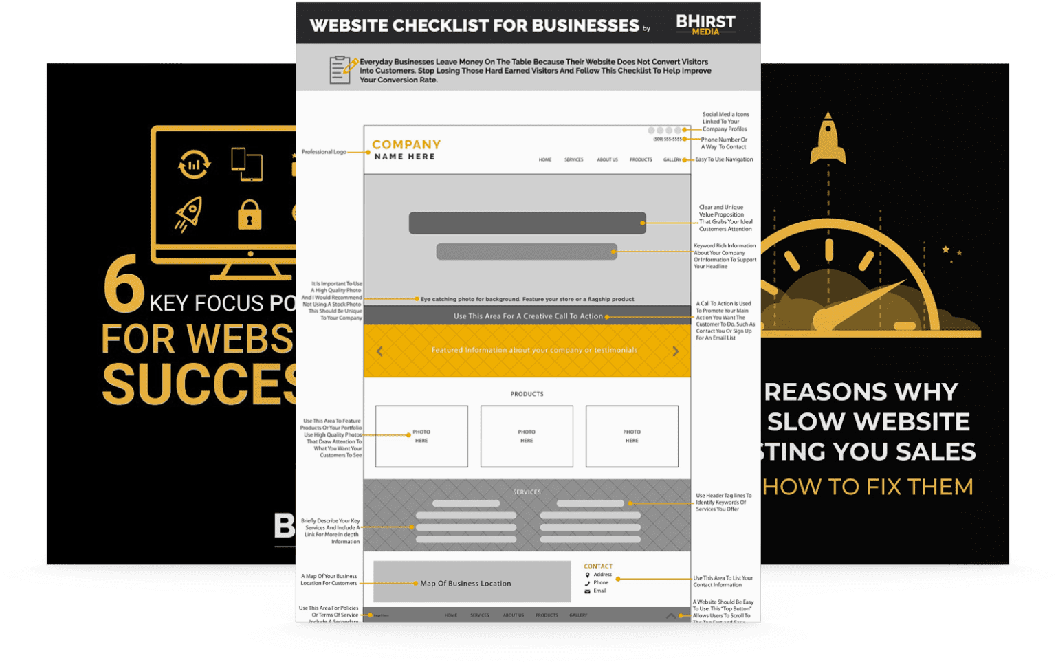
Landing page tactics are essential for maximizing conversions. Picture this – you’ve created an eye-catching ad, your target audience clicks on it, and they’re redirected to… your homepage? A generic product page? You’ve just missed a golden opportunity to turn a visitor into a lead, or even better, a customer. This is where strategic landing pages, the unsung heroes of online marketing, come into play. But what makes a landing page stand out and, more importantly, convert? Let’s find out.
A landing page is a single-focused web page designed to convert visitors into leads or customers. Elements contributing to its effectiveness include a magnetic headline, engaging visuals, and compelling copywriting tailored to simplify design and maximize conversion impact.
Key strategies to improve landing page conversion rates include using social proof to build trust, crafting clear and persuasive calls to action, tailoring pages to specific campaign goals, and ensuring they are optimized for both search engines and user experience.
Continuous measurement and improvement are vital as success metrics for landing pages include conversion rate, pageviews, and bounce rate. Landing page builders can streamline creation while A/B testing is imperative for optimizing effectiveness.
Let’s kick things off with a quick overview of the basics. A landing page, in contrast to a homepage, is a standalone web page that is strategically designed with a single focus – conversion. Visitors reach these pages after clicking on an advertisement, a social media post, or an email campaign. The landing page’s primary objective is to convert these visitors into leads or customers by focusing on a singular offer or action. To better understand this concept and get some landing page inspiration, consider creating your own landing page using a landing page example that showcases a specific product or service.
Landing pages fall into two primary categories – lead generation landing pages and click-through landing pages. To better understand their differences, you can refer to various landing page examples available online. The former primarily uses a form as their call to action (CTA), aiming to gather lead information such as names and email addresses. In contrast, click-through landing pages are structured to guide users to another page to carry out a specific action.
Enhancing the effectiveness of landing pages involves strategies such as:
Linking QR codes on printed materials to specific pages
Developing shareable content
Offering free resources such as ebooks, whitepapers, and webinars in exchange for visitor information
Through these methods, other landing pages can generate leads, enhancing lead generation and increasing conversions.

High-converting landing pages are the result of careful crafting,, combining a captivating headline, engaging visuals, and persuasive copywriting to drive conversions. Each of these elements plays a critical role in capturing the visitor’s attention and motivating them to take the desired action.
As the first element visitors see, the headline can significantly influence their decision to stay on the page. Captivating headlines play a crucial role in capturing the visitor’s attention and motivating them to continue reading. They should be compelling and address the specific problem or need of the reader.
A recommended formula for a headline is to convey the main benefit in 10 words or fewer, while the subheading should provide details or additional benefits in under 20 words.
Engaging visuals do more than just enhance the aesthetic appeal – they can significantly influence the effectiveness of a landing page. One such visual is a hero image, a high-quality, relevant image strategically designed to enhance the visual appeal of the page. The hero image creates a first impression, influences user engagement, and conveys important information promptly.
Videos and animated GIFs also serve as compelling methods for capturing and retaining users’ attention. Concise videos can showcase the functionality of a service, while animated GIFs can swiftly demonstrate a product’s features – all contributing to a more captivating and engaging landing page.
While copywriting is fundamentally the art of persuasion, on a landing page, it takes on the additional role of guiding the reader. Craft conversational, easy-to-follow copy that effectively directs the reader towards the desired action. This could be signing up for a newsletter, downloading a free ebook, or purchasing a product.
Optimizing supporting copy is just as crucial. Use bullet points to emphasize crucial details and consider using tools like Semrush’s SEO Writing Assistant for optimization. Remember, the goal is to make your copy as clear and compelling as possible to guide your visitors towards conversion.
The effectiveness of a landing page is significantly influenced by its design. A clean and simple design reduces distractions and helps keep visitors focused on the offer. For instance, the ClickFunnels and Talkspace landing pages serve as some of the best landing page examples of simple yet effective design. They keep the visitor’s attention where it matters most – the offer.
Maintaining simplicity in design doesn’t necessitate compromising on its visual appeal. The key is to strike a balance between aesthetics and functionality. This includes strategically employing white space to direct the viewer’s focus and craft a visually appealing layout.
White space, often overlooked, can significantly enhance the visitor’s experience on the entire page. By directing attention to vital elements, establishing a distinct hierarchy, and boosting engagement, the strategic use of white space can lead to an aesthetically pleasing and functional landing page.
In web design, white space serves as a powerful tool. It influences the overall design tone, aids in content organization and structure, and enhances text readability and legibility. By creating a sense of balance and harmony in the design, it significantly enhances the readability of a landing page and guides the visitor’s focus, ultimately contributing to increased conversion rates.
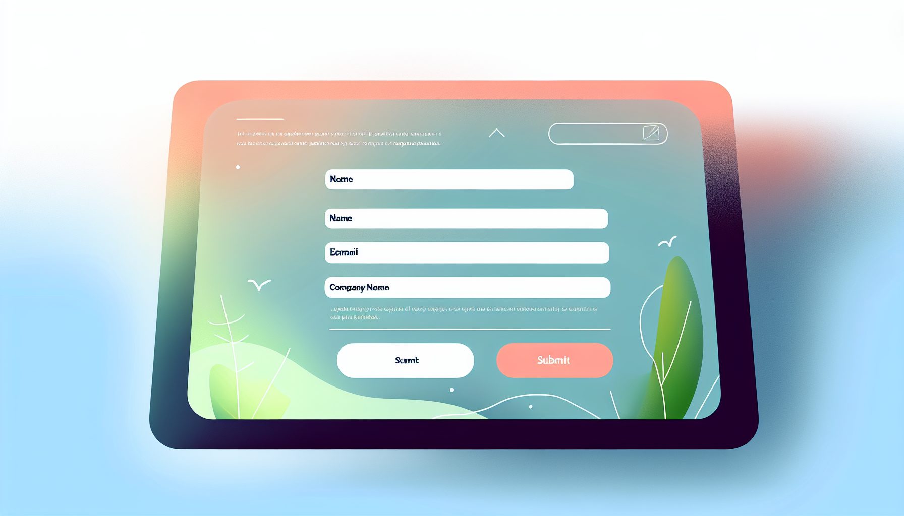
A successful landing page often owes its effectiveness to a well-designed lead capture form. It should be user-friendly and collect only the essential information to optimize conversion rates. However, there’s more to lead capture than just filling out a form.
Advanced techniques like utilizing conversational interfaces, for instance, actively involve visitors in the data-sharing process, making it more engaging and less repetitive. This not only enhances user experience but also increases the likelihood of conversion.

Earning the trust of visitors is fundamental to achieving conversions, and there’s no better way to build trust than through social proof. Social proof, in the form of testimonials and reviews, plays a crucial role in building trust and credibility among visitors to a landing page.
For instance, Wistia’s landing page incorporates a testimonials section to highlight positive feedback from their customers. This not only helps build trust but also provides an insight into the experiences of others with the product or service, significantly influencing the decision-making process of potential customers.
The call-to-action (CTA) serves as a conduit facilitating the visitor’s journey towards conversion. It should be:
Clear
Visible
Guide visitors towards the next step
Make it easy for them to take action.
Whether it’s ‘Sign Up’, ‘Buy Now’, or ‘Learn More’, the CTA should be:
Compelling
Clear
Concise
Create a sense of urgency
Speak in the first person
Align with the page’s goals and value proposition.
A well-crafted CTA doesn’t just stand out visually, but also stands out in the visitor’s journey towards conversion.
Landing pages are not a one-size-fits-all solution, and they shouldn’t be treated as such. Customizing your own landing pages, especially a dedicated landing page, to align with specific campaign goals ensures a consistent message and experience for visitors. So, how many landing pages should you create? It depends on your unique marketing needs and objectives.
This involves creating separate landing pages for different audience segments based on researched keywords each persona would use to find what is being offered. For instance, Semrush’s landing page appeals to marketers managing multiple tools. By increasing the number of landing pages, you can significantly increase leads and enhance SEO performance.
The task of creating a high-converting landing page need not be intimidating. Landing page builders serve to streamline the creation process, enabling efficient design and optimization for better results.
Landing page builders facilitate efficient design and optimization, thus expediting and simplifying the landing page creation process. Essential features include:
A main and supporting headline
A unique selling proposition
Key benefits
Images or video demonstrating context of use
Social proof
A clean and organized design
A strong headline to convey offer value
Mobile-friendliness
The process of landing page design involves critical optimization efforts, catering both to users and search engines. Enhancing the search engine visibility of landing pages involves:
Focusing on keyword research
Curating content and design to align with search intent
Utilizing on-page SEO
Optimizing URLs
Ensuring that landing pages are published to custom URLs.
Specific keywords closely aligned with user search intent and relevant to your products or services can significantly enhance the probability of conversion. Tools like Semrush’s Keyword Magic Tool can be used for comprehensive keyword research.
Remember, optimizing landing pages for users is equally crucial. Ensuring a smooth user experience aids in retaining visitors and supports SEO initiatives by enhancing dwell time and potentially improving search rankings. A well optimized landing page plays a significant role in achieving these goals.
A landing page’s success is determined not solely by its creation, but also by the ongoing evaluation of its effectiveness. Typical landing page metrics that should be monitored include:
Pageviews
Bounce rate
Session duration
Traffic source
Form abandonment
Load speed
Furthermore, A/B testing is an essential technique used to conduct experiments with different versions of a landing page to determine the most effective one. Conversion rate optimization for landing pages entails enhancing the design and layout of the page to boost conversions and improve the overall user experience.
Creating high-converting landing pages is an art that involves a balance of design, copy, and strategy. From crafting a magnetic headline and using engaging visuals to writing persuasive copy, every element of your landing page should work together to drive conversions.
Remember, the key to a successful landing page is continuous testing and refinement. Use analytics to measure success and make necessary adjustments. With the right tactics, your landing pages can become a powerful tool in your marketing arsenal, converting visitors into leads or customers effectively.
At BHirst Media, we know how essential . We’re ready to talk to you about the website design and CTA that is best for you based on your business’ unique goals and visions. Give us a jingle and find out exactly how BHirst Media’s website design and technical support packages bring your website into the 2020’s with style.
A landing page is a website page with a form that captures visitor information in exchange for a valuable offer, such as an ebook or retail discount code. It is designed to convert visitors into leads.
A landing page is designed for a specific campaign or offer, guiding visitors toward a single call to action, unlike homepages and websites, which are intended for exploration. Landing pages are effective for marketing due to their focus on conversion.
The cost of building a landing page can vary from $500 to $3000, depending on technical requirements and design complexity.
The key elements of a high-converting landing page include a captivating headline, engaging visuals, and persuasive copywriting to drive conversions. These elements are crucial for capturing and retaining the interest of visitors.
A clean and simple design reduces distractions and helps keep visitors focused on the offer, while strategically used white space can guide the visitor’s focus and create a visually appealing layout. This can lead to higher conversions.
