Boost Website Conversions with Form Abandonment Reduction Strategies
Key Takeaways
By understanding both practical and psychological reasons behind form abandonment, you can create forms that not only optimize conversions but also build trust and confidence.
Understanding why visitors abandon your forms is key to improving your website’s conversion rates.
Clarity eliminates confusion in forms: Clearly label fields, keep instructions simple, and avoid jargon to ensure users understand exactly what is required.
Short forms drive higher submissions: Minimize the number of fields by focusing only on essential information to reduce cognitive overload for users.
Build trust with strong privacy assurances: Display privacy statements or security badges prominently to reassure users their data is safe.
Highlight benefits to encourage completion: Clearly communicate incentives like offers, demos, or consultations upfront to motivate users to submit forms.
Mobile-responsive forms are non-negotiable: Ensure your forms are optimized for smaller screens with intuitive layouts and larger input fields for mobile users.
Avoid hidden costs with transparent processes: Specify any associated actions (e.g., subscriptions or follow-ups) to avoid surprises and reduce abandonment.
Trust signals boost confidence instantly: Include elements like testimonials, reviews, or recognizable brand logos near your form to reinforce credibility.
Test multiple versions for optimal performance: Regularly perform A/B testing to analyze field placements, CTA language, and visual design for conversions.
Psychology matters: Reduce emotional barriers by addressing privacy concerns, providing clear next steps after form submission, and avoiding messaging that feels pushy or manipulative.
In the sections ahead, we’ll dive deeper into actionable strategies to refine your forms and enhance user engagement.
Converting Abandoned Forms into Engaged Customers
Did you know that 50% of website visitors abandon forms without hitting the submit button? This staggering statistic reveals a critical bottleneck in website conversion—form abandonment. But it also represents a significant opportunity.
Whether you’re running an e-commerce site, a healthcare portal, a lead generation platform, or a business blog, understanding why users drop off before completing your forms can dramatically improve your website’s performance. This article unveils the reasons behind this common issue and provides actionable strategies to optimize your forms, increase submissions, and ultimately boost user engagement across various sectors.
Consider how optimized forms benefit different fields:
E-commerce: Streamlining checkout processes to reduce cart abandonment.
Healthcare: Simplifying patient information forms for better data collection.
Education: Enhancing course registration forms to increase enrollment.
Finance: Optimizing application forms for credit cards or loans to improve approval rates.
Let’s explore how refining your forms can turn abandoned visitors into engaged customers, regardless of your industry.
Common Reasons for Form Abandonment
The moment a user decides to start filling out an online form, they’re already on the path to becoming a lead or a customer. However, a multitude of reasons can cause them to abandon this process halfway. Recognizing these issues is the first step toward reducing form abandonment. Understanding these common pitfalls enables you to proactively address them and improve the user experience.
One primary reason is the overwhelming length or complexity of forms. Users often encounter forms that require too much information, leading to cognitive overload. This phenomenon was highlighted in a study by User Interface Engineering, where they found that for every additional form field over four, the conversion rate dropped by almost 3%. Moreover, if users perceive that the effort to fill out the form outweighs the benefit, they’re more likely to abandon the process, seeking a simpler alternative or giving up altogether. Seamlessly integrating forms into the user journey and minimizing friction points is crucial.
To further elaborate, here are common scenarios leading to form abandonment:
Data Entry Fatigue: Long forms, especially without saving progress, require users to repeat or re-enter information, which is especially taxing on mobile devices where typing is cumbersome. Consider implementing progress bars and auto-save features, especially in sectors like insurance applications or complex financial documents.
Privacy Concerns: The growing awareness of privacy issues means users are more cautious about sharing personal details. Forms without proper privacy policy links or reassurance about data safety can lead to high abandonment rates. This is particularly relevant in healthcare, where patient data security is paramount, and in legal services, where confidentiality is key.
Technical Glitches: Users often abandon forms when they face issues like slow page load times, error messages due to field validation, or even the “required” asterisk on wrong fields that confuse users. Regular maintenance and testing across different browsers and devices are essential to prevent technical hiccups.
To mitigate form abandonment, one must:
Limit Form Fields: Only ask for what’s necessary. Implementing staged forms or step-by-step progress bars can encourage completion by making the process feel less daunting. For instance, in e-commerce, streamline the checkout process by only asking for essential shipping and payment information upfront.
free guide
Ready to grow your E-Commercesales?
Download our free guide to learn how you can grow your E-Commerce business using simple tactics that many store owners skip over or forget about.
The length of a form can be a significant deterrent for users, impacting website form optimization. The paradox of choice plays a role here; more options or fields mean more decision-making, which can lead to user fatigue. A study by HubSpot revealed forms with just one field had conversion rates 45% higher than those with more than seven fields. This highlights the importance of brevity and focus in form design.
Reducing form length doesn’t mean you should compromise on valuable data, but rather find a balance. Here’s how:
Focus on Essential Information: Prioritize what’s absolutely necessary first. Use optional fields for additional details or consider alternative methods of data collection like pre-filled forms for returning users. In sectors like education, gather only the most crucial information during initial enrollment and request additional details later.
Segment the Form: Breaking down the information request into multiple pages or stages can make the process less overwhelming. Each submitted stage provides a sense of progress, encouraging users to continue. This approach is effective in financial applications where users may need to provide extensive documentation.
Clear Next Steps and Reassurance
Form abandonment often stems not just from the technical aspects but also from how users perceive the journey post-submission. Providing clarity on what happens next is crucial for increasing form submissions. Users need to know their effort wasn’t in vain and that their data is in safe hands. Make the submission process feel like a clear and trustworthy transaction.
To enhance user confidence, consider:
Post-Submission Confirmation: Immediately after submission, reassure users with a confirmation message or an email that outlines the next steps or provides access to the promised content or service. For example, in marketing, confirm that the user will receive a newsletter or special offer. In healthcare, confirm appointment bookings and provide pre-appointment instructions.
Privacy and Security: Transparency about how user data will be used and protected is key. Including a simple yet effective privacy policy link or trust badges can significantly reduce form abandonment. This is vital across all sectors, especially in finance and healthcare, where stringent data protection regulations apply. Clearly articulate how the data is protected and used.
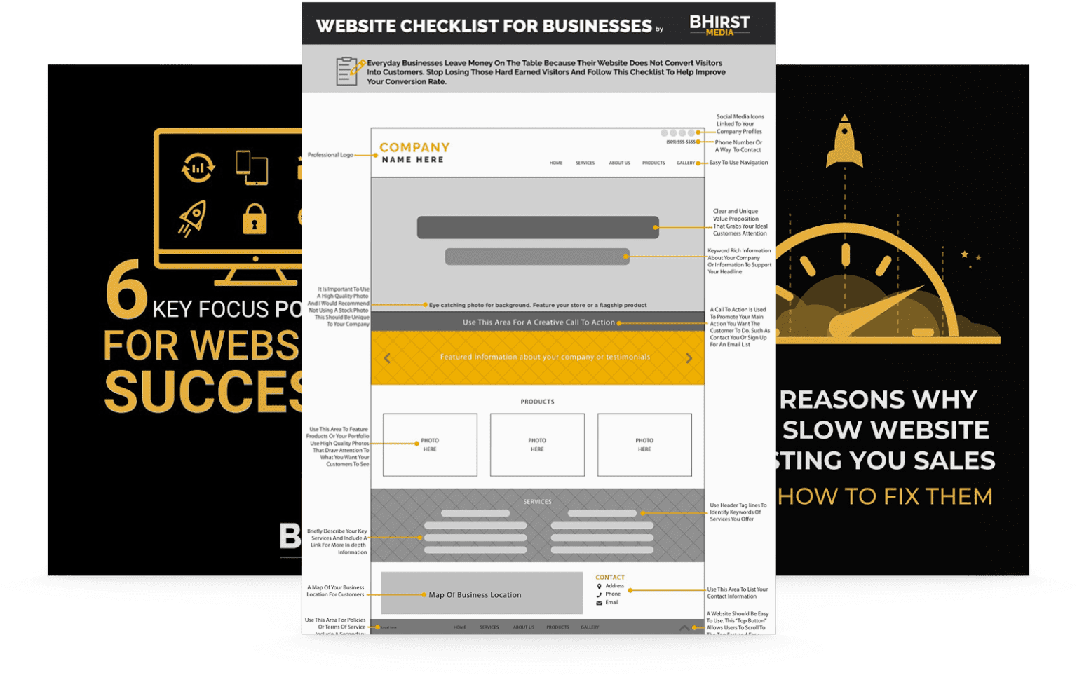
Form Usability Best Practices
When considering contact form best practices, usability should be at the forefront of your design. A user-friendly form is more likely to be completed, leading to higher conversion rates. A focus on intuitive design and clear instructions is essential to ensure a positive user experience.
Form Design
Use Labels Inside the Form Fields: This design minimizes clutter and helps focus user attention on the task at hand. However, ensure these labels disappear upon focus or when typing starts to avoid confusion. Clear and concise labels help the user understand the required input immediately.
Ensure Mobile-Friendliness: Rows upon rows of fields can overwhelm mobile users. Implement vertical layouts where each field takes up at least one line on the screen. Mobile responsiveness is critical for capturing leads on-the-go.
Limit Form Width for Fluid Reading: Reducing the width of form fields or labels can foster a more fluid reading experience, making it easier for users to navigate. Ensure that the design adapts seamlessly to various screen sizes and resolutions.
Addressing Mobile Usability
Given the exponential rise in mobile device usage, mobile testing has become indispensable to website form optimization. Mobile forms often suffer from poor text entry experiences, small buttons, and truncated field labels or instructions. Optimizing forms for mobile devices is no longer optional—it’s a necessity.
When designing forms for mobile:
Input Field Size: Ensure text entry fields are large enough for thumb typing, especially for forms expecting email or full addresses. Consider using larger font sizes and ample spacing between fields to improve readability.
Button Visibility: Buttons like submit or next should be prominent, easy to tap, and adhere to mobile user interaction guidelines. Use contrasting colors and strategic placement to make buttons stand out.
By incorporating these mobile-specific best practices, you can:
Reduce Frustration: Mobile users value simple, focused forms, reducing the frustration associated with multiple fields popping up on tiny screens. A smooth mobile experience enhances user satisfaction and encourages completion.
Building Trust and Reducing Concerns
Trust signals play a pivotal role in overcoming privacy concerns, which often lead to form abandonment. Building trust is essential for fostering a sense of security and encouraging users to complete forms. Transparency and clear communication are key components of establishing trust.
Here are some strategies to build trust:
Use Authoritative Endorsements: Display logos of well-known clients, partners, or certifications to give users an immediate sense of credibility. For instance, a financial institution might display the logos of regulatory bodies or industry associations.
Utilize Live Chat: Offering a live chat for instant interaction signals that help is available, enhancing user comfort. This is particularly useful for complex forms or applications where users may have questions or need assistance.
Clear Privacy Policy: A link to a well-explained privacy policy assures users that their data will be handled with care. Ensure that the privacy policy is easy to understand and accessible from every page where users enter personal information.
By illustrating trust and transparency, you not only improve completion rates but also set the foundation for an ongoing relationship with the user. Trust creates loyalty and encourages users to return for future interactions.
Transforming Form Abandonment into Engagement
With these strategic approaches, website owners can significantly reduce form abandonment. Optimizing forms for usability, addressing psychological barriers, and ensuring mobile responsiveness are all key to increasing form submissions across various industries. Whether it’s streamlining patient registration in healthcare, simplifying loan applications in finance, or enhancing course enrollments in education, the principles remain the same. Every user interaction with your forms represents an opportunity to convert a visitor into a lead or a customer. By focusing on both the technical and emotional aspects of form completion, you can craft forms that not only gather leads but also cultivate trust in your brand.
Looking ahead, businesses that prioritize user-centered design and data-driven optimization will see the greatest success in reducing form abandonment and increasing conversions. The key is continuous improvement and adaptation to evolving user expectations. The real question isn’t just how to minimize abandonment—but how to create a seamless and engaging experience that turns every form submission into a positive step in the customer journey.
HOW WOULD YOU LIKE TO INCREASE YOUR WEBSITE'S conversion&lead generationforfree?!
Enter the Ultimate Website Optimization Bundle - it’s got everything to help you optimize your website, drive more traffic, and convert visitors into leads! With this complete optimization formula, you can get all of these problems solved in one quick swoop!