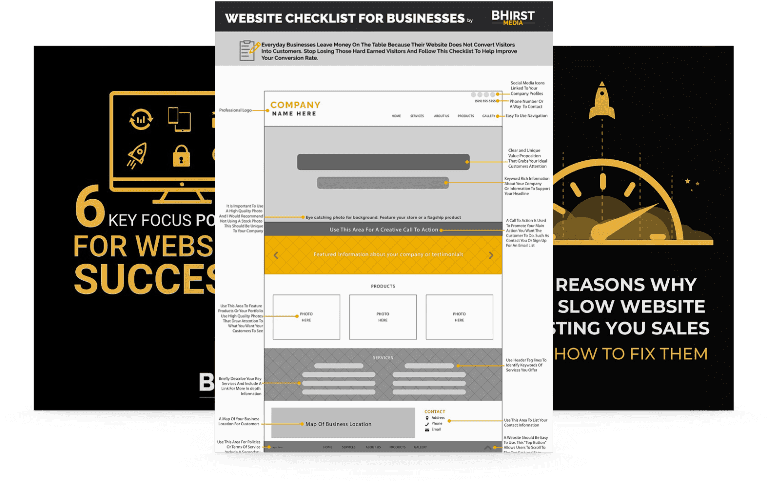
Optimizing your website by reducing clutter not only enhances its visual appeal but also creates a user-friendly environment that drives conversions. In the following sections, we’ll explore actionable design strategies and psychological insights to help you build a highly effective website.
Clutter isn’t just an eyesore; it’s a costly mistake for businesses looking to convert visitors into customers. Imagine a potential customer landing on your website, ready to make a purchase or sign up, only to be met with chaos and confusion instead of clear paths to action.
Why does this matter? In today’s competitive digital landscape, user experience directly influences your bottom line. Cluttered websites overwhelm visitors, hindering their ability to focus, make decisions, and ultimately convert. This choice architecture can critically impact your site’s performance. Beyond e-commerce, this applies universally. For instance, a cluttered healthcare provider’s site might deter potential patients, while a confusing educational platform could discourage prospective students.
Here’s the good news: by understanding and tackling cognitive overload, alongside implementing effective visual design practices, you can create a user-friendly environment that encourages engagement and conversions. Let’s explore actionable strategies to simplify your website, making it not only appealing but also highly effective across various industries.
Website clutter represents more than just an aesthetic issue; it directly influences user behavior and, more importantly, their decision-making process. A cluttered website floods the user with information, making it challenging to discern what actions to take or where to focus attention. This overload can lead to what psychologists call “decision paralysis,” where users, overwhelmed by choices or information, choose to disengage rather than proceed. Studies have consistently shown that users prefer websites that are visually simple, reducing cognitive load and making decision-making more straightforward.
Consider a medical clinic’s website as an example. A cluttered design with multiple calls to action (book an appointment, read testimonials, explore services, etc.) in one view can confuse potential patients. Instead of engaging with the content, the user might leave the site in frustration. This departure translates directly into lost conversions. The psychological principle at play here is the “paradox of choice,” where offering too many options can lead to lower user satisfaction and decision efficacy. Conversely, a clean, uncluttered site allows users to quickly find what they need, reducing barriers and streamlining the decision-making process that leads towards a conversion, like scheduling an appointment. This principle extends beyond healthcare; a financial services site with too many investment options or an educational platform with an overwhelming array of courses can similarly deter users.
The effects of website clutter go beyond mere annoyance; they significantly degrade the user experience, impacting conversion rates across various sectors. Research demonstrates that users spend less time on cluttered pages, reducing the opportunity for the site to convey its message or guide the user towards a conversion. Slow load times, excessive ads, or numerous pop-ups can further increase user frustration, often leading to an immediate exit from the website. This behavior isn’t sporadic; it’s a direct response to the cognitive overload imposed by clutter.
Consider the example of an e-commerce website where a customer is looking to purchase a specific product. If the site’s navigation is convoluted and product listings are interspersed with unrelated ads, irrelevant content, and poorly placed CTA buttons, the shopping experience becomes arduous. As a result, instead of making a purchase, the user might abandon the site for a competitor offering a simpler, more intuitive online shopping experience. Here, decluttering could increase the conversion rate by facilitating a smoother, quicker path to purchase, directly linking UX improvements to business outcomes like sales and customer retention. The principle applies similarly to other fields. For instance, a cluttered legal firm’s website might deter potential clients seeking immediate assistance, while an overwhelming educational portal could discourage students from enrolling in courses.

Building on the impact of first impressions, it’s crucial to understand the psychological factors at play when users interact with a cluttered website. When users first land on a cluttered website, they unconsciously perform a quick inventory of the visual elements to navigate the page. This immediate assessment can determine whether the user stays or abandons the site. Psychological research highlights that clutter increases the cognitive load, pushing users towards a state of decision fatigue where they are less likely to engage with the content or take action. This phenomenon is particularly detrimental for e-commerce sites where decision-making directly leads to purchases, but it also impacts fields like healthcare, education, and finance, where informed choices are essential.
For example, a user intending to buy a pair of shoes online might encounter a website overloaded with navigation options, ads for unrelated products, and cluttered product pages. The cognitive effort needed to sift through the noise drains mental resources, making the purchase decision more burdensome. A streamlined, visually appealing site, on the other hand, not only reduces this cognitive load but also instills a sense of confidence and clarity, encouraging conversion. As users navigate through a clean environment, their focus can remain on making informed decisions rather than wrestling with a messy interface. This applies equally to a patient seeking medical information, a student choosing a course, or an investor evaluating financial products. In each case, reducing cognitive load enhances user experience and improves decision-making.
Grounded in design principles and user psychology, effective decluttering starts with a comprehensive audit of your website’s content and design. Here are practical steps to create a more streamlined user experience:
Implementing these strategies results in a cleaner, more focused website that directly influences user satisfaction and conversion rates across various industries.
Real-world applications consistently demonstrate the tangible benefits of decluttering across diverse sectors. Take the before-and-after case of “Boutique Events,” a wedding planner’s website. Initially cluttered with multiple services stacked in the header and sidebar, users experienced decision paralysis, resulting in a high bounce rate. Following a redesign where they decluttered the navigation to showcase only primary services, featured packages, and a clear call to action for booking a consultation, “Boutique Events” saw:
Another example is “TechTrends,” a blog about the latest tech gadgets. They previously presented articles in a way that overwhelmed readers, with too much text and cluttered sidebar recommendations. After decluttering:
Consider also “HealthFirst,” a healthcare provider that simplified its patient portal. By decluttering the interface and focusing on essential functions like appointment scheduling and medication refills, they observed:
These examples highlight how simplifying user navigation and focusing on content hierarchy can enhance user engagement and deliver measurable business results in various fields.

Decluttering a website isn’t just about aesthetics or user satisfaction; it’s a strategic move with tangible ROI across various business functions. Here’s how design principles can impact key business metrics:
In essence, decluttering is not merely about design; it’s a strategic investment that yields measurable business benefits, helping businesses thrive in a competitive online landscape. Businesses that invest in cleaner website design see improvements in customer satisfaction, streamlined operations, and increased profitability.
Decluttering your website is more than a design overhaul; it’s a transformative strategy to enhance user experience and amplify conversions. By alleviating cognitive overload, simplifying navigation, and implementing effective design principles, you ensure that users stay engaged and seamlessly move toward conversion points, regardless of your industry. Moving forward, businesses that prioritize user-centric design and continuous optimization will lead the way in digital engagement. This involves not only decluttering but also adapting to evolving user behaviors and technological advancements. The real question isn’t just whether you’ll declutter your website, but how you’ll integrate simplicity into your broader business strategy to create long-term value and drive sustainable growth. Start decluttering today and experience the difference it can make in user satisfaction and your bottom line.
