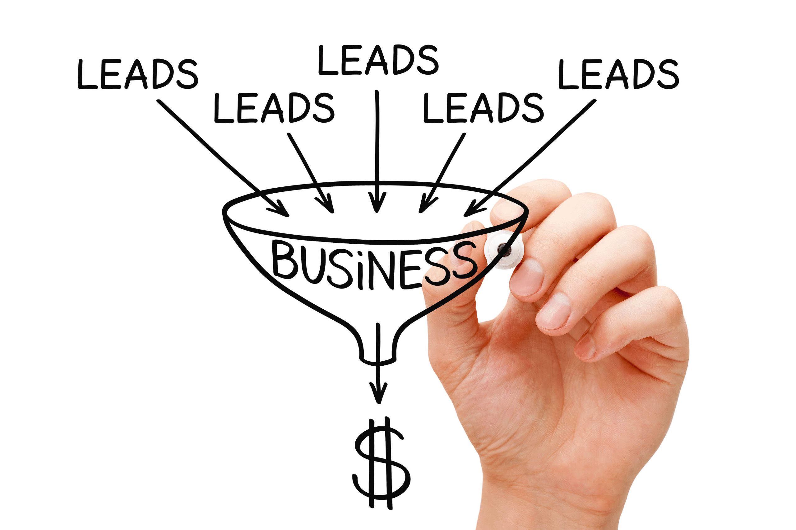
We’ve all heard that phrase, “If you build it, they will come.” Only you did build it, and they didn’t come. So now you are searching for ways to generate leads with your website. Or, maybe your website has been hanging around the Interwebs for quite some time, and traffic is starting to trickle, or perhaps it’s even come to a screeching halt.
Neil Patel once said, “Your leads are only as good as the website that produces them.” Lucky for you generating leads from your website doesn’t have to be this overwhelming, time-consuming task.
It’s actually quite simple to generate leads with your website, and we’re going to show you how with just a few tweaks – or maybe for you it’s additions – your website can start converting leads for the growth of your business.
Here are the most notable ways you can generate leads by increasing conversions along with your site’s authority and trust faction — a win-win for everyone.
While having an entire page devoted to lead generation is not mandatory, it does come highly recommended. You may be using your whole website, and its URL as your lead, but a lead generation page – also called a landing page – is an entire page devoted to your message.
It allows the visitor to learn everything it needs to know about you, your company, and the products or services you provide without having to click around your website to find out. Think of it as an “About Us” website page only with more sellable, targeted content, and a call to action (CTA). Homepages – which is where your visitor lands when they click your URL – don’t typically have a CTA. Homepages are more information based.
“A landing page is a standalone web page, created specifically for the purpose of a marketing or advertising campaign. It’s where a visitor “lands” after they click on a link in an email, or ads from Google, Bing, YouTube, Facebook, Instagram, Twitter, or similar places on the web” – Unbounce

Once you’ve got a landing page loaded and ready to go, you want to have easy access to that page posted on every page within your site. By posting forms, you increase the chances to be seen, thus, increasing the number of potential leads through your website.
Make sure you post your lead generation forms above the fold. This will increase the likelihood that customers will notice the form front and center before they’ve had a chance for their eyes to roam elsewhere. Use arrows or other visual cues to entice them.
You’d be surprised at how many companies do not put a contact number on their website. If you’re selling digital products or services, it may seem like you don’t need to bother with posting your number but doing so leads to trust and credibility on your part.
Your customers may never call, but the fact there is a number for them to call should they feel they need to bring them comfort. If you’re hesitant to post your cell phone or business phone number on the web, sign up for a Skype phone number or Google Voice number.
Use this number to filter business only calls from the website and other areas that would benefit from having this number posting like social media accounts.
Reviews and testimonials are a powerful marketing tool for your lead generation. Strong testimonials and positive reviews can significantly impact your lead generation landing page then one without.
Go a step further and provide your visitors with photos and videos of the people behind the testimonies and reviews. This shows your visitors your authority and authenticity.
Don’t just use videos for testimonies and reviews. Use them for yourself. Use videos to speak to your visitors. Videos can bridge the gap between eCommerce and brick & mortar stores and significantly increase lead generation. Videos have a greater chance of converting visitors into leads into paid customers than visitors who simply just read an ad. Videos show authority. It gives a voice. Users can relate when they see the person behind the business.
There are quite a few seals of trust out there for your website, and they all claim they can increase your lead generation. Don’t add seals to your website strictly for cosmetic purposes. Choose a seal for your website that is backed up by a guarantee to the consumer.
One may think that using big words would make your business sound better because it makes you sound smarter or more presentable in your field. In reality, you want to use power words when describing your offer. Action verbs like “get,” “feel,” and “have” are powerful compellers because of their active tones. If you were to say, “imagine getting,” it would not have the same appeal causing you to lose out on a conversion.

Avoid cookie-cutter website templates. If your website looks like everyone else’s, it’s not going to stand out in a crowd and therefore not generate any new leads no matter how good your landing page is. Get the best custom-made website template your budget will allow for. Well designed websites gain trust from visitors.
Whatever your menu or call to action buttons say they’re going to take a visitor needs to be what they land on. Everything must match, and it must stay clean and simple. If someone doesn’t request something, don’t take them to where you want them to be. Take them where they want to be. To generate leads with your website, you need to think about what you would want when you visit a website. Would you want to click somewhere to read something, and it takes you to a completely different place. It would probably frustrate you. If it frustrates you, it will discourage them. Keep your website navigation all clean, simple, neat, and tidy.
When it comes to lead generation, think about your end goal first. Think about what a lead means to you. Once you’ve defined this, your testing and analytic goals will become much more apparent. It will also help you think about each stage of your call to action as visitors progress through your landing page.
A few things to consider:
Once these are defined, your goals should be easier to adjust through conversions.
Using that negative space – whitespace – on your website can significantly impact lead generation – if you use it wisely. You don’t want things cluttered and unreadable but don’t be afraid to take up space. Give everything space to breathe – call to action buttons, photos, videos, and even content. Make sure everything on your website is there to serve you, not hinder you. Too much hindrance can lower your lead generation rates.
What works for one company may not work for another. As you go through these tips and start implementing them on your website, some of them may not work. That is okay. Or maybe, they do not work the way described here. That is okay, too. You’ll have to do a little bit of leg work and test, test, and test again to see what works for you and your company.
“Contact Us” appears on just about every website out there – and for a good reason. It is the easiest way to get visitors’ attention and find the spot to contact you if they want more information. That is its one purpose, so don’t use it as your CTA. It’s too vague for that. Instead, make your CTA all about generating a lead.
“Download a free trial,” “Request a callback,” “take our readiness assessment” are all great ways to generate leads without being generic.
Are you ready to generate leads with your website and not sure where to start? Maybe you need help building, creating, and writing a landing page.
You’ve come to the right place. BHirst Media is a U.S. based digital agency that offers web design and development, and we’re here to help with your website needs. Learn more about how we can help you today, and together we’ll walk you through every step, so you don’t have to get bogged down by the hard stuff.
