
Have you ever loaded a website on your smartphone that took forever, had tiny text, and was hard to navigate? If you have, you know pages must adjust to the device they’re on.
Say a business’s website takes a long time to load or is frustrating to navigate. In that case, potential customers may click or tap away to a competitor with a better site. To avoid this, business owners need to understand the difference between responsive websites and mobile-friendly websites and determine which strategy is best for their needs.
In this blog post, we’ll explore responsive websites and mobile-friendly website strategies, define their differences, and highlight tools available to assess whether your website is optimized for either. By the end of this post, you’ll have a better understanding of which approach is best suited for your business and how to ensure your website is fast and easy to use across all devices.
Simply put, a mobile-friendly website displays all its content correctly when viewed on a mobile device. This includes but is not limited to the text, photos, videos, and links that make up the site.
In other words, “mobile friendly” means taking advantage of mobile devices’ abilities. These abilities include providing information fast to people on the move.
Google is becoming more stringent on how mobile-friendly a website must be. The search engine points to three mobile-unfriendly flaws that might worsen the user experience.
Do you want to ensure your site is mobile-friendly? Google says responsive website design is “the easiest, most efficient, and cost-effective solution.”
Responsive web design adapts to the user’s demands and the screen size of the device they use to access it. For example, a single column of text and images could replace three columns in a PC design. A responsive design conceals images inessential to the site’s functions. That way, the focus remains on the content.
You can test your site’s responsiveness yourself by shrinking your browser window. When viewing on a smaller screen, the text, graphics, and menu should adapt to fit the space available.
Essential aspects of mobile-friendly websites include:

A simpler, mobile-friendly site allows for a uniform experience across all platforms. While these sites may not wow you with their functionality or unique features, they do the job.
You should consider optimizing for mobile if:
You can make your mobile experience as custom as possible with responsive design. Expertise, careful preparation, and a bigger budget are likely necessary to achieve this goal. Do you want to ensure your site is as welcoming as possible to all visitors? You might opt for web services from a professional web developer.
Consider adopting a responsive strategy if:
Use this test to see how your website loads on different screen resolutions. How to know your website is responsive: if everything adjusts to all screen sizes.
Did your site stay the same? You might need to consider a more responsive web design. You could be losing website traffic. Why? Because people find scrolling or struggling to tap elements on mobile frustrating.
Use this test from Google to see if your website is mobile-friendly. After a moment, when Google tests your site, it will let you know if it loads easily on a mobile device.
If Google tells you your website doesn’t load quickly enough, you should consider making your website more mobile-friendly.
A few things you can do to optimize a website for loading on a mobile device include:
If you’re feeling unsure about how to make your website mobile-friendly or responsive, seeking the help of a professional web developer can be a great option. A skilled developer can provide the necessary tools and services to optimize your website’s appearance and functionality across all devices. From website design and technical support to ongoing maintenance and care plans, there are a variety of services available to ensure your web presence remains top-notch.
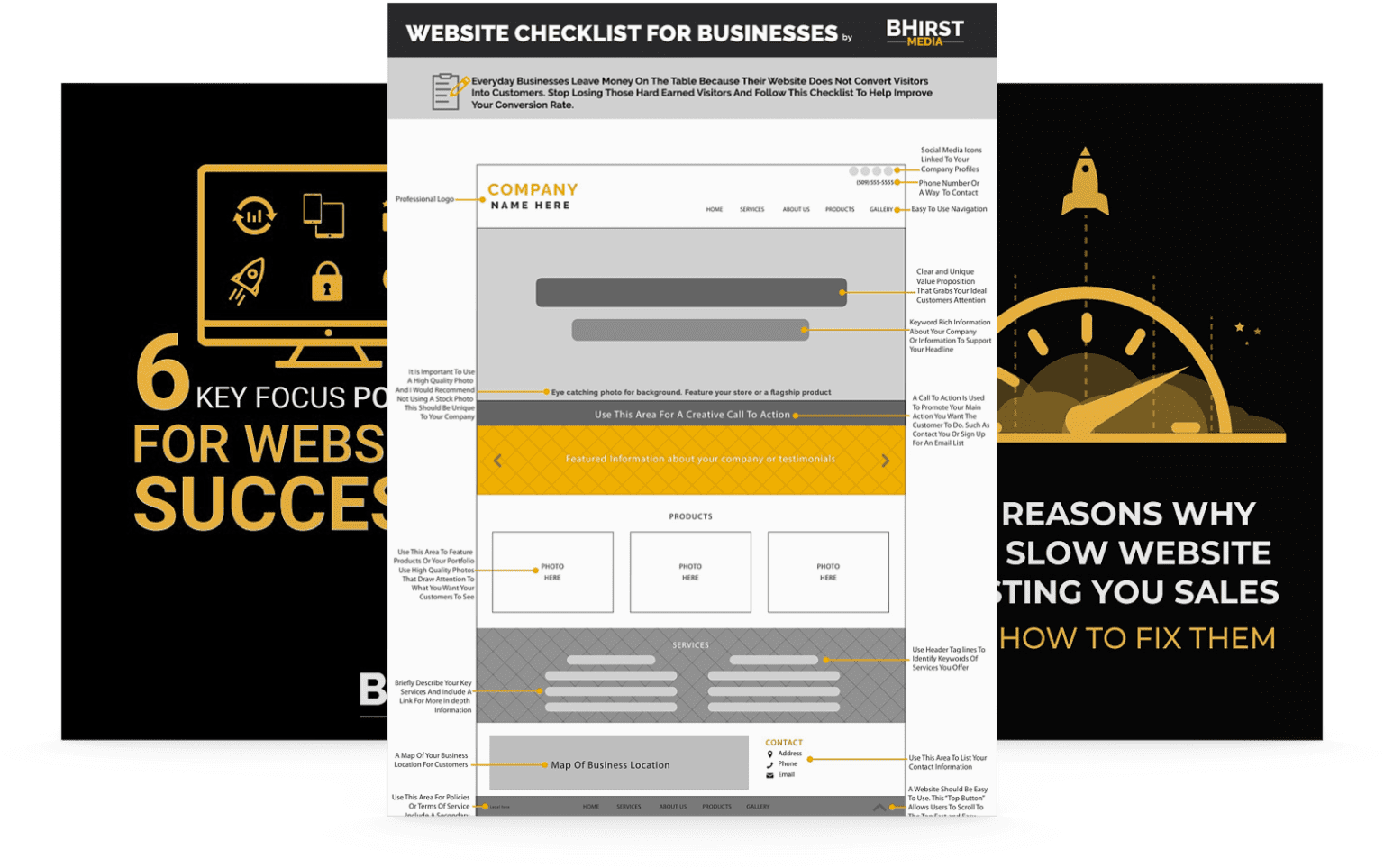
BHirst Media is a trusted expert in web design and development, and we welcome any questions you may have regarding your website’s mobile-friendliness or responsiveness. Don’t hesitate to reach out to us for assistance.