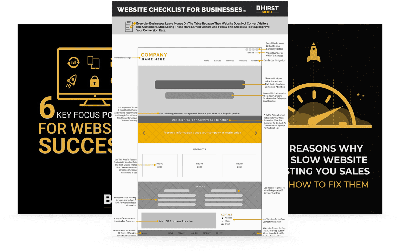
A well-optimized homepage strategically combines design psychology with user-centric best practices to transform fleeting attention into lasting engagement. As we go deeper, explore actionable insights on designing a homepage that not only looks great but also converts effectively.
Your homepage has just five seconds to make an impression. That’s it—five fleeting moments to capture attention, communicate value, and convince visitors to stay. In this critical window, users aren’t reading—they’re scanning, absorbing only 20% of your text while their brains process visuals 60,000 times faster than words.
Most businesses squander this precious opportunity with cluttered designs and unclear messaging. The result? Visitors hit the back button, and potential customers vanish forever. But by understanding how users actually interact with your site—not how you wish they would—you can transform your homepage into a conversion powerhouse.
This guide reveals the science-backed tactics that turn those critical five seconds into lasting engagement. From strategic hero section design to psychological color principles, you’ll discover how to create a homepage that not only captures attention but converts visitors into loyal customers. These aren’t just design tips—they’re business growth strategies disguised as design decisions that apply across industries, from e-commerce and healthcare to finance and education.
The moment a visitor lands on your homepage, the clock starts ticking. Research reveals that users form their first impression of your website in just 50 milliseconds, deciding whether to stay or leave within 5 seconds. This window is the most critical moment in your conversion funnel—a chance to communicate value or risk losing potential customers.
Visitors don’t read; they scan. Eye-tracking studies show that users scan rather than consume your text, reading merely 20% of it while processing images 60,000 times faster than words. Your homepage must communicate impact immediately through bold visuals and clear visual hierarchies instead of lengthy descriptions.
Align every homepage element to focus on instant value communication. For instance, Stripe increased their conversion rate by 38% when they redesigned their homepage to feature a simple headline, an illustration, and a key CTA—all above the fold. Similarly, healthcare providers like Cleveland Clinic have optimized their homepages to quickly connect patients with services through prominent appointment scheduling buttons, resulting in a 27% increase in online bookings.
This scanning behavior remains consistent across industries—from financial services where Vanguard simplifies complex investment options with clear visual pathways to educational platforms where Coursera guides users to course catalogs with minimal cognitive effort. Understanding this universal human behavior is the foundation for creating a homepage that performs in those critical first seconds.
Your hero section forms the crux of first impressions—it’s where visitors decide whether to stay or leave. Instead of overwhelming users with excess detail, focus on answering their key question: “What’s in it for me?”
Mailchimp optimizes their hero section with a compelling value proposition—leading to a 30% increase in signups—while Airbnb’s visuals emotionally connect their users to the product experience. Beyond tech companies, healthcare provider Kaiser Permanente uses hero sections that immediately address patient concerns with clear navigation to services, while financial platform Robinhood simplifies investing with a clean hero section that communicates “commission-free investing” in seconds.
The agricultural technology company John Deere demonstrates this principle effectively by showing equipment in action alongside clear value statements, connecting immediately with their farming audience. By focusing your hero section on immediate value delivery rather than company history or technical specifications, you create an emotional and practical connection within those critical five seconds.

Call-to-action (CTA) buttons are your homepage’s action drivers. To maximize conversions within the 5-second window, CTAs must be visible, actionable, and clear. The key is understanding that CTAs represent the bridge between interest and commitment.
Netflix’s “Get Started” CTA, positioned centrally with bold design, encapsulates how intuitive CTAs convert interest into action. In healthcare, Mayo Clinic’s “Request Appointment” button uses high-contrast colors and clear positioning, leading to a 23% increase in appointment scheduling. Educational platform Khan Academy’s “Start Learning” CTA drives immediate engagement by removing barriers to entry.
Industry-specific CTAs that perform well often address the primary user need directly: legal service companies use “Get Legal Help Now,” finance platforms implement “See Your Options,” and nonprofits utilize “Make a Difference Today.” A/B testing from enterprise software company HubSpot revealed that personalizing CTAs based on user behavior increased conversion rates by up to 42%, demonstrating that contextual relevance is as important as visual design.
When crafting your CTAs, focus on what users can gain rather than what they must do—this psychological shift transforms passive interest into active participation within those critical five seconds.
Humans are social creatures who look to others for decision validation. Within the 5-second window, effective social proof can establish immediate credibility and reduce decision friction. It transforms uncertainty into confidence by showcasing that others have already validated your offering.
Different industries leverage social proof in unique ways. E-commerce platforms like Wayfair prominently display review counts and satisfaction ratings directly on product images. Healthcare provider Cleveland Clinic showcases their rankings in medical specialties. Financial service Betterment displays the total assets under management to establish market trust quickly.
Educational technology company Duolingo highlights their 300+ million users front and center, while manufacturing equipment supplier Grainger displays industry certifications that matter to their professional audience. Law firm websites often showcase case success rates and client testimonials to establish immediate expertise.
The effectiveness of social proof isn’t just anecdotal—research shows that properly implemented social validation elements can increase conversion rates by up to 34% in those critical first seconds. Hospitality platform Booking.com masterfully integrates real-time booking notifications to create urgency through social validation, demonstrating that showing active usage creates powerful conversion momentum.
With over 60% of web traffic now coming from mobile devices, the 5-second rule becomes even more critical on smaller screens where attention spans are shorter and distractions are greater. Mobile optimization is no longer optional—it’s the primary battleground for first impressions.
Visitors process mobile content differently due to vertical scanning patterns and smaller screen sizes. Your mobile homepage must prioritize speed, functionality, and design simplicity.
Simplified mobile layouts, like Booking.com’s, focus on essential elements alone, streamlining the user experience. The banking sector demonstrates the importance of mobile optimization—Bank of America’s mobile homepage provides immediate access to login, account balance, and transfer functions, resulting in 36% higher mobile banking engagement.
Healthcare provider Teladoc optimized their mobile homepage for one-tap appointment scheduling, leading to a 41% increase in mobile conversions. Retail giant Target implemented vertical scrolling product categories with large touch targets, improving mobile purchase completion by 26%.
Google’s research shows that for every additional second a mobile page takes to load, conversions can drop by up to 20%. This statistic proves particularly relevant for service industries like insurance, where GEICO’s mobile-first approach with immediate quote tools delivers conversion rates nearly double the industry average.
For mobile optimization success, think of your homepage as a conversation that must deliver value in seconds while accommodating the unique constraints and behaviors of on-the-go users across industries and demographics.
Creating an effective content hierarchy means organizing information in a way that aligns with natural scanning behavior. With only 5 seconds to make an impression, your content structure must guide visitors intuitively through your value proposition.
QuickBooks increased signups by presenting benefits as bullet points—a scanning-friendly adjustment that sped decision-making. The healthcare sector demonstrates this principle effectively—Johns Hopkins Medicine structures their homepage with clear pathways for patients, doctors, and researchers, with each segment having distinct visual hierarchies that guide different user types to relevant information quickly.
Government websites have made significant improvements in this area. The IRS redesigned their homepage with task-based navigation that aligns with how citizens actually seek tax information—resulting in 29% faster task completion and reduced support calls.
Research from the Nielsen Norman Group shows that users spend 57% of their time above the fold and 74% of their time on the left side of the screen. Educational platform Chegg leverages this behavior by placing their most compelling offer (first month for $4.99) in the upper left with contrasting colors, resulting in a 24% lift in trial signups.
The manufacturing sector has adopted these principles as well—3M’s product-focused homepage uses clear visual hierarchies to guide industrial buyers to product categories in seconds rather than overwhelming them with the company’s vast catalog. By structuring your content to match how humans naturally process information, you transform scanning behavior from a challenge into a conversion opportunity.
Visual storytelling outshines text by engaging the brain faster. Whether through transformational comparisons or immersive imagery, visuals dominate the first 5 seconds by communicating complex ideas instantly.
Asana’s visual-first homepage led to a 38% increase in signups—demonstrating the persuasive power of images. The real estate industry exemplifies effective visual communication—Zillow uses high-quality property imagery with subtle overlays showing key information, allowing potential buyers to process dozens of homes quickly while focusing on properties that match their preferences.
Healthcare providers like Mayo Clinic use reassuring imagery of doctors with patients to convey trust and care before a single word is read. The automotive industry leverages this principle exceptionally well—Tesla’s homepage features vehicles in aspirational settings with minimal text, letting the visual design communicate innovation and desirability instantly.
Travel company Airbnb’s infamous redesign focused on immersive destination photography that triggers emotional responses—their internal testing showed users made booking decisions 32% faster when emotional imagery dominated the homepage.
The food and beverage industry demonstrates that product visuals drive immediate desire—Starbucks’ seasonal campaign homepages feature close-up imagery of limited-time offerings, driving a 24% increase in featured product sales. Financial service Wealthfront uses simple visual charts showing investment growth to communicate complex financial concepts in seconds.
By prioritizing visual communication, you’re working with human biology rather than against it—the brain processes images 60,000 times faster than text, making visual-first design the most efficient way to communicate within the 5-second window.
The 5-second rule isn’t just a design principle—it’s a measurable benchmark that can be continuously improved through systematic testing. A/B testing offers data-backed insights into what works (and what doesn’t) within this critical timeframe. Optimize for clarity and focus, not just aesthetics.
Tools like Crazy Egg helped ConvertKit identify and reposition poorly engaged areas, leading to significant performance improvements. Major retailers like Walmart continuously test homepage elements against the 5-second benchmark—their testing revealed that reducing homepage carousel speed by 30% increased engagement with featured products by 15%.
Healthcare provider Cigna conducted 5-second tests of various hero section layouts, discovering that benefits-focused headlines outperformed feature-focused ones by 32% in visitor recall tests. This insight led to a homepage redesign that significantly improved their key performance metrics.
Financial institutions implement rigorous 5-second testing to ensure essential banking functions are immediately discoverable. Chase Bank’s testing revealed that moving their login area to the upper right corner with distinct coloring reduced login time by 7 seconds on average—a seemingly small improvement that significantly enhanced customer satisfaction.
Educational platform Udemy uses 5-second testing to optimize course discovery, finding that category-based visual navigation outperformed search-first approaches by 28% for new visitors. Manufacturing equipment supplier Grainger discovered through heatmap analysis that technical buyers focused immediately on specification information, leading them to redesign product pages with prominent technical details.
The key insight from cross-industry A/B testing is that optimization should focus on what users actually do in those first seconds—not what stakeholders think users should do. This data-driven approach transforms homepage design from subjective opinion to objective performance.
Moving beyond basic optimization, the most sophisticated homepages adapt to individual users and incorporate subtle psychological triggers that work within the 5-second window. These advanced techniques create the feeling that your website understands the visitor personally.
Spotify’s auto-playing animations improved engagement by 218%, aligning perfectly with scanning behavior. The travel industry exemplifies advanced personalization—Expedia shows different homepage content based on user location, search history, and time of year, resulting in a 43% improvement in booking initiation.
Healthcare providers implement sophisticated personalization too—OneMedical’s homepage adapts to show nearby clinics and relevant services based on location data. This contextual relevance resulted in a 36% increase in appointment scheduling within the first visit.
Financial services firm Fidelity personalizes their homepage based on investor profiles, showing retirement tools to older visitors and education resources to younger ones. This targeted approach improved engagement rates by 28% compared to their generic homepage.
E-commerce giant Amazon uses perhaps the most sophisticated behavior triggers—subtle animations highlight personalized recommendations and recently viewed items, creating a custom experience within seconds of arrival. Their testing shows personalized homepages convert at rates 26% higher than generic versions.
B2B technology company Salesforce implements industry-specific entry points, showing healthcare-focused messaging and case studies to visitors from medical institutions while displaying retail-oriented content to visitors from that sector. This targeted approach improved lead quality by 34%.
These advanced techniques represent the frontier of homepage optimization—creating experiences that feel individually crafted while still delivering value within those critical first seconds.
To truly optimize your homepage for the 5-second rule, you need precise metrics that reveal user behavior during this critical window. Traditional analytics often miss the nuanced interactions that determine whether visitors stay or leave.
By focusing on micro-metrics like “time to first click,” companies like Atlassian saw conversions climb by 27%. The retail sector demonstrates sophisticated measurement—clothing retailer ASOS tracks “time to first product view” as a critical indicator of homepage effectiveness, finding that reducing this metric by just 0.8 seconds increased browse-to-buy conversion by 13%.
Healthcare systems measure homepage effectiveness through “time to appointment booking initiation,” with Cleveland Clinic optimizing their layout to reduce this metric from 37 seconds to 12 seconds—dramatically improving patient acquisition.
Educational institutions track “program discovery rate”—how quickly prospective students find relevant degree information. When the University of Michigan redesigned their homepage with a prominent program finder, they saw a 28% increase in application initiation within the same session.
Financial services company Charles Schwab uses sophisticated exit-intent tracking to identify where potential clients abandon their homepage journey. This analysis revealed that complex terminology caused early exits, leading to a simplified language approach that improved new account openings by 18%.
These measurement approaches work across sectors because they focus on universal human behavior—how quickly users find value and take action. By implementing these metrics, you transform homepage optimization from guesswork to scientific improvement, ensuring those critical five seconds work harder for your business goals.
Your homepage has just five seconds to capture attention, communicate your value, and drive action. By focusing on user scanning behaviors, simplifying visuals, crafting compelling CTAs, and leveraging trust-building elements, you can meet the psychological and functional needs of your visitors across any industry.
The organizations succeeding in this space understand that homepage design isn’t about aesthetics—it’s about aligning with how human attention actually works. From healthcare providers guiding patients to quick appointments to financial institutions establishing immediate trust, the principles remain consistent even as applications vary by sector.
Looking forward, the competition for attention will only intensify. Organizations that will thrive won’t be those with the flashiest designs, but those that masterfully compress their value proposition into those critical first moments. As artificial intelligence begins to influence design, successful homepages will increasingly adapt in real-time to individual visitors while maintaining the clarity and focus that the 5-second rule demands.
The real competitive advantage lies not in following design trends but in deeply understanding your specific audience’s scanning patterns and decision triggers. By continuously testing, measuring, and refining how you communicate within this narrow window, you transform fleeting impressions into the beginning of lasting customer relationships.
The question isn’t whether your homepage makes an impression in five seconds—it absolutely does. The real question is whether that impression compels action or creates indifference. By implementing these research-backed strategies, you ensure those critical seconds work powerfully toward your business objectives, regardless of your industry or audience.
