Your website’s design and content profoundly influence user experience, conversions, and overall performance. By strategically removing outdated or ineffective elements, you can create a cleaner, more engaging site that drives results. Here are some actionable tips to help you declutter your website and transform it into a high-performing asset:
By removing ineffective elements, your website can deliver a streamlined and enjoyable experience, maximizing both user satisfaction and conversions. This strategic approach not only enhances the user experience but also reinforces your brand’s credibility and effectiveness. Ahead, we’ll dive into practical steps and tools for implementing these strategies to create a high-performing website across various sectors.
In the digital realm, your website serves as your business’s virtual storefront, often making the first impression on potential customers. In fact, studies show that 25% of visitors abandon a website due to poor design elements and clutter. Given this significant impact, it’s crucial to rethink your digital strategy and ensure your website is optimized for engagement and conversions.
Website clutter doesn’t just annoy visitors; it can drastically reduce your chances of converting them into valuable leads. From outdated design trends to ineffective calls-to-action (CTAs), every element on your site must work harmoniously to deliver an engaging user experience. A disorganized or confusing website can deter visitors, leading to lost opportunities and diminished brand perception.
Let’s delve into the specific things to remove from your website to boost user engagement, enhance design, and ultimately drive more conversions. By decluttering strategically, your site can become a beacon of clarity and intent, enhancing both its look and performance. This transformation will not only make your website more appealing but also more effective in achieving your business goals.
Imagine meticulously crafting your website, filling it with content you believe is essential. Over time, however, what once seemed vital might just be adding to the noise. Regularly reassessing your website’s content is crucial, and here’s why:
First off, website clutter can be a major turn-off for potential customers. With increasingly shorter online attention spans, if your site takes too long to get to the point or is difficult to navigate, you’ll lose visitors. Clutter doesn’t just mean a plethora of text; it includes elements like irrelevant images, flashy animations, or intrusive pop-ups that can cloud your main message. A cluttered website can lead to frustration, causing users to leave before they even consider your Call to Action (CTA). This is particularly true for healthcare sites, where ease of navigation can impact patient satisfaction, and financial service sites, where clarity builds trust.
Imagine visitors being focused and navigated smoothly through key information, ending with a compelling call to take action. This opportunity arises from removing outdated, unnecessary elements that no longer serve the user’s journey or your business objectives. Keeping your website focused can reduce bounce rates, subconsciously guiding users deeper into your site, and ultimately improving conversion rates across industries—from e-commerce and retail to education and environmental services.

Let’s delve into the frequent pitfalls that website owners, even seasoned ones, might overlook, and how these mistakes manifest across different sectors:
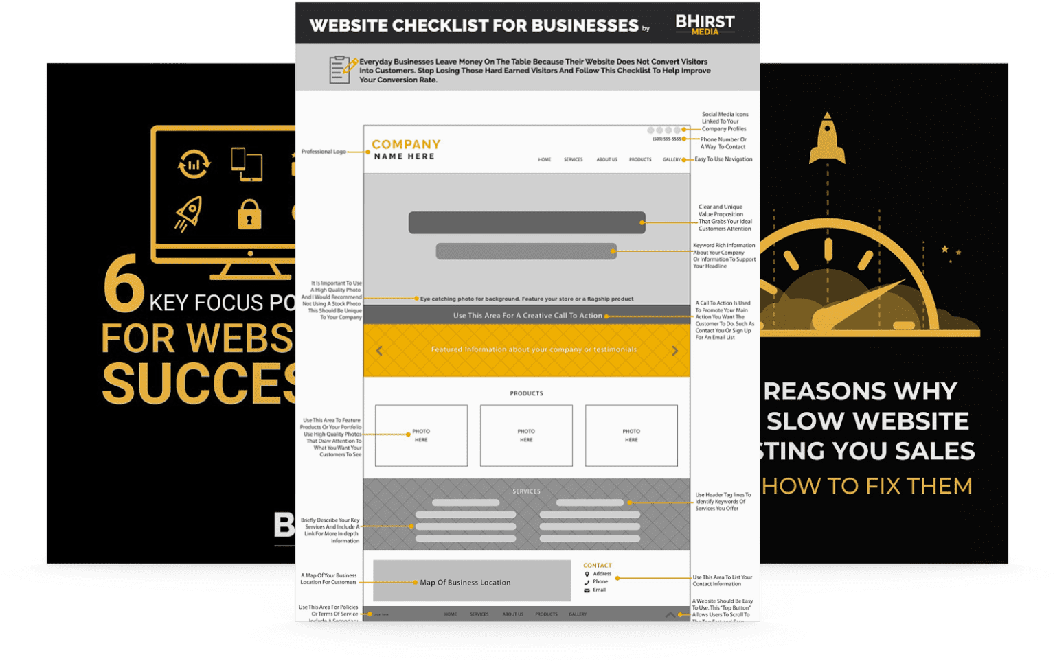
The digital landscape is constantly evolving, which means your website design should too. However, many websites still rely on elements that have outlived their utility. Here are some you might want to revisit:
A website in today’s digital age should convey professionalism, brand identity, and simplicity in equal measures. Old-school animations and flashing elements can seem more like a relic from the early internet days rather than an inviting business space. For example, the carousel slider, once all the rage, tends to distract rather than highlight specific products or services. Users often don’t watch the entire cycle, diminishing engagement and conversions. In e-commerce, this might mean customers miss key product features or sales.
The result of these poor design choices? Higher bounce rates. A clean, intuitive user interface is not a luxury; it’s a necessity for optimizing conversion rates and encouraging visitors to turn into leads. This is critical in the competitive retail market and essential in healthcare for patient portals ensuring ease of access to crucial medical information.
Streamlining your Calls to Action (CTAs) is about being clear, direct, and persuasive. Here’s the thing: why should your website visitor click? and how can you make the journey from visitor to customer as seamless as possible? Consider CTAs across various sectors:
Often, CTAs can be drowned in website clutter or styled too similarly to the surrounding content, failing to stand out. You want your CTAs not only to solve a problem for your user but also to be immediately actionable. For instance, “Try Our Software Risk-Free for 30 Days” beats a general “Try Now” any day. Clarity is key for CTAs in environmental science, where actions like “Calculate Your Carbon Footprint” can drive user engagement.
Case Study: A software company replaced a generic “Get Started” button with a specific “Schedule a Free Demo,” resulting in a 14.5% increase in demo requests due to a clearer path to action. This principle applies universally; a marketing agency might use “Get a Free Marketing Audit,” while a healthcare provider could offer “Book Your Consultation Today.”
Decluttering your website goes beyond improving the immediate user experience; it can significantly impact SEO rankings and site usability. Let’s explore this dual benefit, considering applications across industries:
Actionable Steps: Start by reviewing your site’s analytics to understand user behavior, pinpoint friction, and identify where users commonly exit. Tools like Google Analytics or heatmap software can provide these insights, helping you determine exactly which elements to declutter or refine. For a legal firm, analyzing user paths can reveal whether visitors struggle to find contact information or specific legal services.

In a world saturated with stock photography, authentic imagery can be your website’s unique selling proposition. Here’s how you can achieve this, keeping in mind the needs of different industries:
Website visitors crave authenticity, especially in an age where AI-generated content and stock images can seem generic. Using genuine photos or custom-designed graphics can build trust, convey professionalism, and make your brand more relatable. For example, a local café showcasing real customer reviews alongside candid pictures of the café’s atmosphere might resonate more with potential patrons than a generic café image. This approach is also effective in healthcare, where real patient testimonials and staff photos can build trust.
However, authentic imagery comes with its challenges:
Your Opportunity: Utilize authentic photos strategically, like on your homepage or product/service pages, where the user needs that visual reinforcement to make a decision. Replacing stock images with authentic ones throughout your site can not only make your website stand out but also lead to a more honest, trustworthy digital presence. This is also applicable to the finance sector, where images of real employees can foster a sense of reliability.
A decluttered website isn’t just visually pleasing—it’s a strategic tool that drives engagement, user satisfaction, and conversions across all sectors. By removing outdated elements, streamlining calls-to-action, and emphasizing authenticity, your site can stand out in today’s competitive digital space. Assess your current design, content, and performance, and start implementing these strategies to create a high-performing, user-friendly website that delivers results.
Looking ahead, businesses that prioritize adaptable strategies and data-driven design will lead in an increasingly competitive landscape. Whether optimizing site speed, refining user interfaces, or enhancing content relevance, the next era of digital success will belong to those who not only adapt but anticipate user needs and technological advancements. The real question isn’t if you’ll declutter your website—but how effectively you’ll use these strategies to gain a competitive edge and foster deeper engagement with your audience.