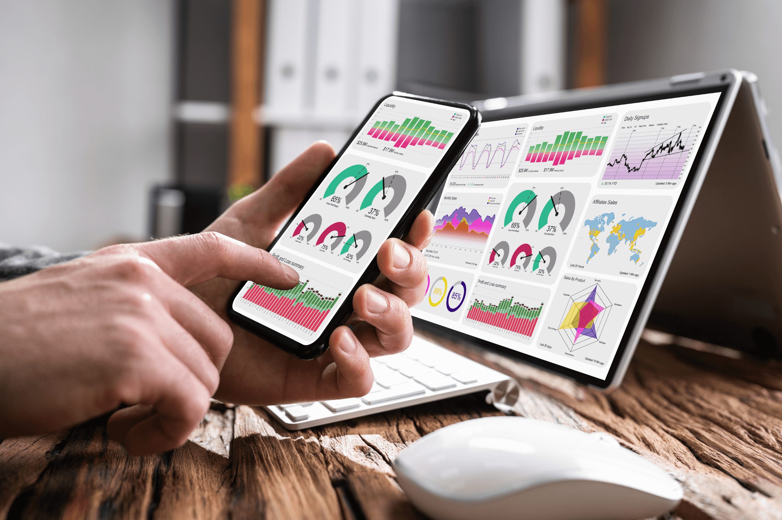
What’s a mobile-friendly website? There are millions of pieces of content, and all you have to do to access it is just open your phone.
With so much content, you’ll need a way to stand out from the crowd. There’s branding, your message, and a million other ways to cater to your customer. But here is one fact that you might be overlooking.
About 50% of people who view websites are viewing them from their mobile devices. (According to Oberlo)
While your content may be some of the best and most engaging content in the world, if there is any friction in the deliverance, then your potential customers will lose interest because it’s hard to read from their phones.
So how do you make sure your content is delivered in a way that creates the best user experience?
Here are the top 5 ways I’ve discovered that will make yours a mobile-friendly website:
When writing any type of content, you should never write in big long paragraphs. While this may have been a good thing in school, it’s not pleasant in the eyes of your everyday reader. Statistics show that most people can’t read above a 5th-grade reading level.
So when writing content, make sure that your word choice is simple, easy to understand, and is clear.
Writing for clarity is the most important thing. Your reader wants things in a short, concise, and fast manner, especially when viewing on the phone. So to help your content be more engaging and more attention-grabbing, try to add
This will help your reader/consumer digest the information better, leading to a more impactful experience. Keep your message short and to the point. Want a secret? Try eliminating adverbs from your content. This will help you sound more authoritative while also cutting out unnecessary fluff.
There are thousands of different fonts to choose from. While you may find a font that meets your style, it may be hard to read for some people. When picking a font, it can be tempting to go for something that is fancy and could impress your reader, but it’s best to stay simple.
Staying simple with your font choice is less likely to build friction between your reader and the valuable content you’re trying to give them. Don’t be afraid to use potentially “boring” fonts to get your message across clearly and concisely. Here are some fonts that are great for you to start using.

One of the mistakes that happen when viewing content on a mobile device is pushing your CTA out of sight. It may be visible on a desktop but not always on a mobile device. Having buttons in the most accessible places is the best way to convert leads into customers.
When deciding where to place your buttons on a mobile device, try and place them towards the top, middle, and bottom of the page. Placing them in these locations makes them the first and last thing your readers see. Make sure to have your strongest CTA at the top of the page.
Buttons are the closers in this process, so make sure they’re easy to access, have inviting words, and don’t have a lot of friction with them.
Apart from really compelling words, images can help you convey your message and tie your brand together. Having great images can help you reach the point you’re trying to articulate in your content. But there are a few things that you need to keep in mind when selecting pictures.
When selecting pictures, ensure they are appropriately sized and are fairly obvious in why you’re putting that specific picture in your content. You should also be mindful of using clear images, preferably with a 4k resolution. Images are a great way to add an extra layer to your brand’s personality.
One of the most underlooked aspects of creating your content to be mobile-friendly is creating colors that contrast. Having colors that contrast will not only make your words easier to read but also make your brand seem more professional overall.
For example: Don’t use white on yellow. These colors next to each other would be hard to see and look tacky and unprofessional.
But let’s say that your brand color is yellow. You could add black to get a good dark and light contrast. This will make your brand pop leaving your potential customers knowing who you are and what you stand for.
Creating website content that stands out from the crowd can be challenging. Look for ways to tailor your website to your observer’s specific needs. Clarity is one of the most important things. Other than that, just remember…
If you’re looking for help making your website content more mobile-friendly, contact BHirst Media.
