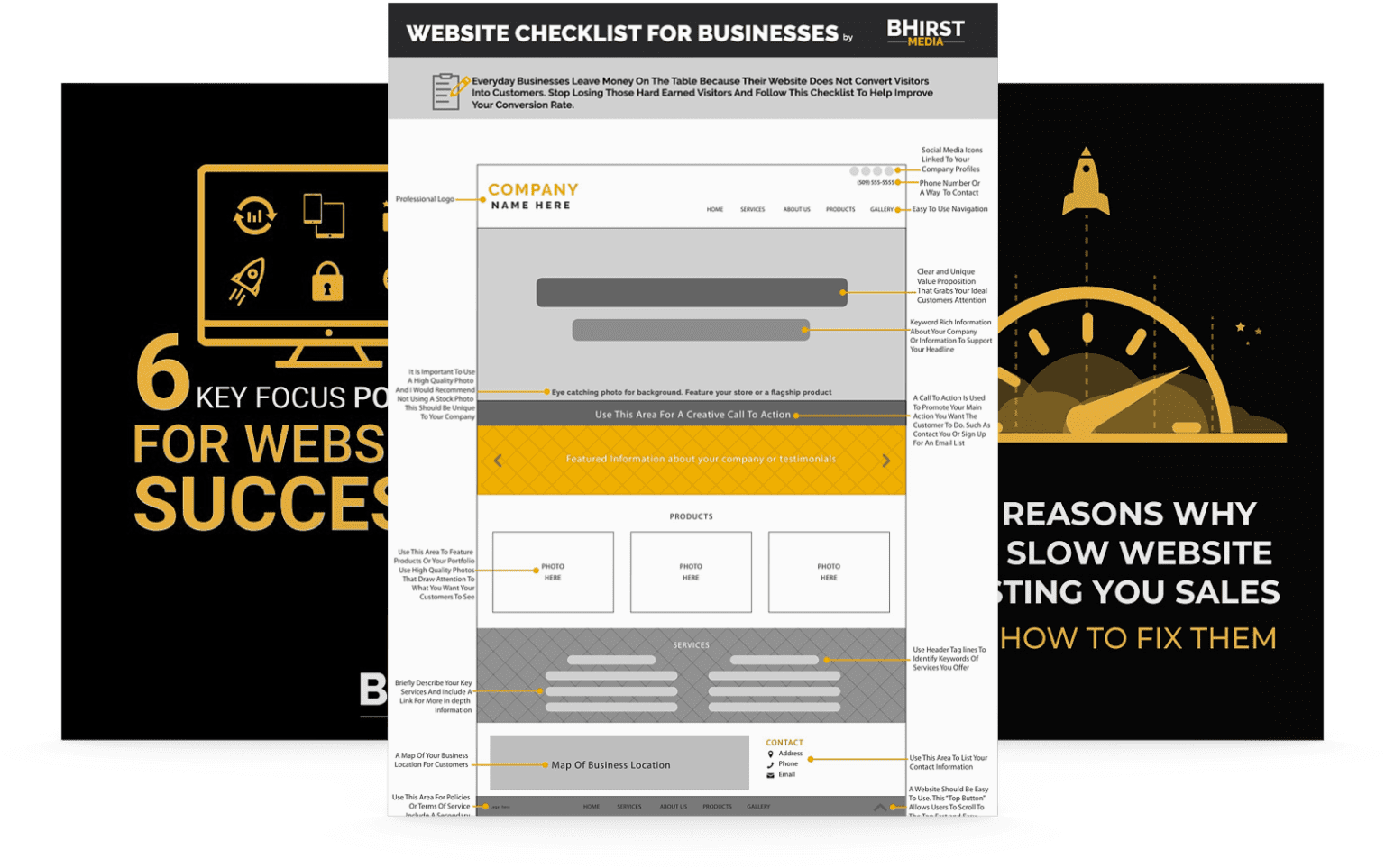
Your website is going to be made of many different web pages. You may have “About Us” and “FAQ” pages. You might also have blog posts and individual product pages that branch off from your home page. Of course, the specific pages on your site will vary depending on your business and website needs. But, no matter what your site looks like, a clear navigation menu is going to be essential.
Whether you are a business owner or an experienced web designer, it’s important to pay attention to navigation menus. Invest some time into understanding web navigation tools and formatting. Fortunately, in this post, we’ll offer a complete introduction to website navigation. You’ll walk away knowing about the different types of menus, their importance, and the best practices for implementing them.
Website navigation menus help users browse your site and travel between categories. If you sell apparel, the navigation menu might list different types of clothing. That means if a customer wants to buy shoes, the navigation bar will help them avoid scrolling through pants and shirts. It’s an important feature that helps visitors find the information that they are looking for.
There are different ways that navigation menus can be stylized. You may have a navigation bar at the top of the page or a hamburger menu that creates a drop-down list of categories. Additionally, many sites may have multiple navigation menus that work together and support each other. Certain pages may have breadcrumbs that indicate what larger groups they belong to. Other sites may have sidebar navigational elements or a footer at the bottom.
It’s vital that the people viewing your website find it easy to navigate. After all, if visitors struggle to find the pages they are interested in, they may just move on to look at a competitor’s website. So, prioritizing the website user experience is really important if you’re trying to make sales and convert potential customers.
It’s also important to pay attention to user experience for other reasons. If people get frustrated because your web page is difficult to navigate and move on to other sites after a few moments, this can be bad news. Not only does it mean that you will lose their business, but your bounce rate will be affected as well.

The bounce rate is important because it’s a metric that indicates the quality associated with a visit to your site. Search engines like Google use bounce rates as part of the algorithm that determines page rankings. So, you don’t want to have customers leave your site after a few seconds because it is difficult to navigate. If this happens, your ranking on the search engine results page may suffer.
You want to rank highly for relevant keywords because this will help you reach more customers. Most people don’t look beyond the first page of Google search results and often, they don’t even scroll past the first few.
Of course, there are many factors that will affect your overall page ranking, and bounce rate is just one. But a strong SEO strategy will mean combining multiple methods that improve the quality of your site. So, if you want to rank highly – and you should want to – you will need to spend some time working on the navigation design elements.
It may be tempting to get creative with your navigational structure so that your website design can stand out if it is compared to similar sites. However, in general, it is best to keep navigation menus simple and intuitive. If people can’t find the navigation bar then they will likely give up and go to another site. Menus with a layout that is hard to understand or that are not responsive are likely to produce similar results.
Navigating a website should always be as easy as possible. As a first step, you’ll want to make every navigational element highly visible and prominent on the page. Stick with conventional placements, like a main navigation bar at the top of the page. You’ll also want to use contrasting colors so that the text stands out and is able to be clearly identified as a link.
It’s also important to think about combining different methods of navigation for your site. A menu at the top of the page is useful, but depending on your site layout, you may benefit from a footer or sidebar as well. To optimize your site for mobile devices, you may also need to create a different navigational structure for mobile viewing.
Breadcrumbs are another great feature that shouldn’t be overlooked. They will contain links to the categories that contain the page you are viewing. So for a product page for boots, you may see breadcrumbs that look something like “All products > Shoes > Boots”. Breadcrumbs will help users understand where the page they are viewing is located in the larger context of your site.
The navigation systems in a website can have a huge impact on user experience. People want to browse websites with minimal effort or thought. So it’s important to install intuitive menus that provide handy links to everything a visitor might need. Websites that are confusing to navigate will result in a high bounce rate. This can mean that your sales and search engine results page ranking will both suffer. Therefore, it’s important to spend some time creating a series of navigation tools that put the user first.
